Responsive web design is a crucial technique for ensuring that websites offer an optimal viewing experience across a myriad of devices, from desktops to smartphones. This design approach dynamically adjusts content to fit the screen it’s viewed on, offering improved user interaction and accessibility regardless of device size or orientation.
In this guide, we’ll explore the mechanics of what is responsive web design, its significance in today’s mobile-centric world, and the core principles that make it work effectively.
Table Of Contents
Key Takeaways
- Responsive web design is crucial for creating websites that provide a seamless user experience across various devices such as tablets, laptops and mobile phones. It uses fluid grids, media queries, and flexible images to ensure that web pages adapt dynamically to different screen sizes and orientations.
- Despite similarities in their goals, responsive and adaptive web design take different approaches. Responsive web design uses CSS media queries to automatically adjust to any screen size, while adaptive design requires multiple static layouts for different devices, based on screen width.
- Leveraging CSS frameworks like Bootstrap, Foundation, and Tailwind CSS can streamline the development of responsive websites, offering pre-written rules, reusable components, and consistent UI across webpages, contributing to a more efficient workflow and collaboration.
Understanding Responsive Web Design
In today’s digital age, with the multitude of devices from which internet access is possible, the significance of responsive web design has escalated tremendously. The essence of this approach lies in crafting websites that dynamically adjust to match the user’s device environment and deliver an uninterrupted user experience across different screen sizes and formats.
With mobile internet traffic now constituting over 51%, it has become imperative for web design to be responsive. This methodology not only improves how users interact with websites, but also amplifies SEO effectiveness—elevating website prominence on search engine listings.
The Definition Of Responsive Web Design
Responsive web design focuses on creating web pages that adapt to the size and orientation of the user’s device. It uses HTML for structuring content and CSS for styling, ensuring that a site looks good across different devices. Cascading style sheets (CSS) facilitate aesthetic changes, including layout modifications, by employing media queries.
Media queries are pivotal in responsive web design as they allow cascading style sheets to implement varied styles depending on the device’s features. This responsiveness is essential for optimising user experience no matter what device is used to access a website.
How Responsive Web Design Enhances User Experience

Responsive design centers on the user experience by ensuring a unified design across various devices. It simplifies navigation for users, who find it easier to engage with sites due to consistency when moving between different devices.
On responsive websites, images offer several advantages.
- They seamlessly adapt to fit any screen size, maintaining their suitability and aesthetics on every device.
- The uniformity in design coupled with recognisable navigation contributes positively to user contentment.
- Such adaptable image resizing is crucial for an ideal visual experience regardless of the device used.
Core Principles Behind Creating Responsive Layouts
Developing responsive layouts encompasses several key practices.
- Employing fluid grids, which utilise percentage widths, allows html elements on a web page to adjust dynamically across various screen sizes so that they remain in proportion to each other.
- To maintain both the high quality and correct aspect ratio of images as screens change size, responsive design incorporates flexible images that resize appropriately.
- The use of media queries is essential. These enable the implementation of distinct CSS styling rules contingent upon the particular attributes of a device, including its screen width and height.
Together, these components improve both the organisation and legibility of a web page when accessed via an array of devices.
Why Responsive Web Design Matters To Business Owners
Responsive web design eliminates the need for web development for each individual device. It helps businesses in many ways. This is an excellent example of a responsive website development that is able to save you money at all costs. You’ll also find this easier since you only need one site instead of a couple.
Responsive vs. Adaptive Design
In the realm of web design, understanding the distinction between adaptive and responsive approaches is essential. They both endeavor to enhance user experience on various devices yet employ distinct strategies in doing so.
Responsive web design employs CSS media queries to fluidly alter the layout according to the screen size of each device, ensuring a uniform content viewing experience irrespective of the device used. Conversely, adaptive web design involves loading static layouts that have been specifically optimised for certain screen dimensions, necessitating unique designs tailored for diverse devices.
Understanding Adaptive Design
Adaptive design in web design refers to the method of developing various unique versions of a website, specifically tailored for an array of devices. This strategy played a key role historically as one of the first methods employed to optimise websites for mobile users.
These users would typically be rerouted to distinct sites designed for either desktop or mobile use. By focusing on prevalent screen sizes during development, adaptive design ensures optimised performance on particular devices.
To carry out adaptive design, there’s reliance on server-side scripting techniques that assess user-agent details provided by the HTTP GET request from browsers. Doing so enables servers to identify and deliver either dynamically generated content or static pages that align with the correct version suited for each user’s device.
Why Responsive Design Prevails
A responsive website offers several benefits that make it a preferred option. The initial investment in crafting a responsive design is rewarded with reduced maintenance efforts down the line, as there’s no need to alter distinct layouts for different devices. Its adaptability across various screen sizes makes it resilient against the emergence of new or unconventional devices.
Employing flexible page layouts that seamlessly reflow content, responsive websites deliver an even and uninterrupted experience on any device, thereby enhancing user contentment.
Essential Components Of Responsive Web Design
Responsive web design is comprised of key features such as Flexbox, responsive grids, media queries, and flexible images. Utilising the CSS module known as Flexbox enables a dynamic and adaptable arrangement of webpage elements to fit screens even when their dimensions are not predetermined—this aspect is vital for achieving responsiveness in web design.
Crafting a responsive grid requires attention to several considerations.
- Identifying intended screen sizes
- Specifying layout metrics including widths of columns
- Determining the number of columns to be implemented
It’s important to establish gutters and margins that will ensure uniform spacing across different device sizes within the responsive grid system.
Fluid Grid Systems
A fundamental aspect of responsive web design is the implementation of fluid grid systems, which utilise a layout approach that dynamically adjusts container element sizes through percentage-based values. This technique ensures that elements on the page are resized in relation to varying screen dimensions, resulting in a scalable and adaptable interface.
With columns serving as critical structural components for segmenting pages into sections, responsive grids are meticulously crafted to preserve uniformity across layouts when viewed on an array of devices. Their intrinsic design allows these column widths to adjust proportionately, maintaining consistency throughout different viewing contexts.
Media Queries In Action
Responsive web design hinges on the clever use of media queries, a feature of CSS3 that allows for the implementation of different style sheets according to various characteristics of viewing devices such as their screen size or orientation. This is achieved through @media rules in CSS, which apply specific sets of properties only when predefined conditions are met – these can range from being dependent upon:
- The width range within which a screen falls
- Whether a device’s screen orientation is portrait or landscape
- If it concerns print-oriented devices
- Whether the device boasts a high-resolution display
This ability to conditionally trigger styles makes it possible to craft web experiences that are adaptable and responsive across myriad devices and screens, vastly enhancing user interaction.
Such responsiveness includes altering layouts with regard to whether users hold their devices vertically or horizontally. Media queries empower designers by enabling them to toggle visibility for certain elements depending on need while also allowing fine-tuning adjustments like font sizing so content remains legible regardless of the end-user’s choice in apparatus.
Flexible Images & Media

In the realm of responsive web design, adaptable images and media are essential. The resizing and scaling to accommodate changes in layout is chiefly governed by CSS techniques. Images should employ CSS directives like max-width: 100% and height: auto for preserving their aspect ratio without being distorted or cropped inadvertently.
Tools such as Cloudinary can streamline the delivery process of responsive imagery by automatically adjusting them according to device specifications including dimensions and pixel density.
Executing a responsive design requires configuring background images via CSS so that they properly scale up or down and reposition themselves suitably on various screen sizes. This ensures consistency across different devices when accessing content on the web.
Crafting A Mobile-Friendly Website
Creating a website that caters to mobile devices requires a particular finesse. The focus is on ensuring the content is key and navigation is straightforward. With a ‘mobile-first’ strategy, one starts by designing for smaller screens with an emphasis on the essentials and then scales up using media queries to cater to larger devices.
In achieving faster load times for pages viewed on mobile gadgets, responsive grids are pivotal. They employ fluid layouts instead of heavy code meant for various specific device layouts. This approach enhances the user experience across different types of devices by providing efficient scalability in design.
Implementing Viewport Meta Tags

The meta name viewport tag is essential for optimising websites to be mobile-friendly by adjusting the visible region of a web page, known as the viewport. This area changes with different devices and can be managed through this specific meta tag.
By embedding meta name=’viewport’ content=’width=device-width, initial scale=1.0’> into a webpage, it directs the browser to align the width of its content with that of the device’s screen while setting an initial zoom level at 1.0.
It is critical for enhancing user experience that all webpage content fits within the viewport without necessitating horizontal scrolling or out-zooming since users should have access to all website information directly in their viewable screen space on any device they might use.
Prioritising Content For Mobile Users
For those who utilise mobile devices, the prominence of content cannot be overstated. To fine-tune your material for such users, consider these strategies:
- Craft succinct and attention-grabbing titles
- Omit extraneous information
- Segment lengthy text blocks into shorter ones
- Employ lists and subheadings to facilitate quick reading
- Tailor content by utilising individuals’ names or their navigation history
- Adapt content according to local regions
Adhering to these guidelines will significantly boost engagement from users on mobile platforms.
Ensure that calls-to-action (CTAs) are noticeable and easy to find for device users – this is a crucial element in fostering effortless interactions on mobile platforms.
Testing For Mobile Responsiveness
It is essential to verify that websites are mobile responsive, providing a smooth user experience across various device screen sizes. Tools such as Responsinator, Browser Stack, CrossBrowserTesting, and Testsigma can be employed for this purpose.
These instruments provide an array of features that support both interactive and automated testing of responsiveness on diverse devices and web browsers.
Nevertheless, it’s critical to recognise the superiority of conducting tests on actual mobile devices since simulation tools might not fully replicate the unique aspects like mobile CPU architectures or other specific characteristics linked with each device.
When carrying out responsiveness testing, design elements need careful attention to guarantee efficient grid layouts, legibility of text at assorted viewport dimensions, adaptability to different orientations, and navigation that is easy for thumb use.
Scaling Images & Text For Responsiveness

Ensuring that images and text scale effectively guarantees their proper display and legibility across a variety of devices, proportionally resize images, optimising their resolution on more compact devices to save space.
As the size of the browser window fluctuates, the responsive design dynamically conforms these images to fit diverse screen widths seamlessly without distorting them.
The application of a 100% max-width setting on image properties allows for flexibility in scaling down as needed while preventing enlargement beyond their true dimensions—preserving their original quality. This approach keeps responsive images consistent with various device screens they are viewed on.
Setting Max-Width For Images
In responsive web design, it is vital to define a maximum width for images so that they don’t exceed the dimensions of their container, allowing them to adapt seamlessly across different screen sizes. The use of the max-width property in CSS serves this purpose by restricting an element’s expansion beyond a specified point, which contributes significantly to preserving the integrity of the layout on larger displays.
To achieve responsiveness and scalability with images within your web design efforts, applying 100% as the value for an image’s width via CSS is typically more effective than other methods. This approach ensures that while images are fluidly adjustable relative to their parent elements’ size, they will never breach their allocated space.
Using Relative Units For Font Sizes
In responsive web design, it’s crucial to implement font sizes with relative units. These units, such as em and rem, derive their size from the parent elements or the root element’s size respectively, facilitating smoother scaling on various screen resolutions compared to fixed units like pixels. The em unit is contingent upon the font size of its parent element.
Conversely, rem units are linked to the root element’s font size and offer a more consistent approach for managing CSS3 font sizing. Designers must provide pixel-based fallbacks in their font-size specifications to maintain compatibility with legacy browsers.
Navigating Breakpoints In Media Queries
Like searching for the ideal fit, maneuvering through breakpoints in media queries ensures that a website’s design adjusts to accommodate various screen sizes by changing the elements’ layout or style once the browser window hits certain widths.
By establishing several breakpoints, one can achieve a responsive design that delivers an uninterrupted user experience on an array of devices such as smartphones, tablets, and desktops.
Identifying Common Breakpoint Ranges
In the field of responsive design, it is crucial to establish standard breakpoint ranges that cater to common device widths. These typically encompass:
- 600px
- 768px
- 992px
- 1200px
These thresholds are designed to ensure optimal viewing across a wide spectrum of devices, including desktop monitors, laptops with smaller screens, tablets and smartphones.
To achieve precise customisation for different sizes of devices, multiple breakpoints can be set within CSS. This allows for tailored responsiveness that matches the specific dimensions of various gadgets.
Strategies For Choosing Your Breakpoints
Selecting appropriate breakpoints is a tactical choice. Breakpoints that are centered around content focus on the flexibility of how content is displayed, rather than adhering to specific device screen widths, to guarantee superior functionality and readability.
In responsive design, media queries enable font sizes to be modified by assigning fixed values that adjust at each breakpoint. This approach helps preserve clarity of text and consistent visual appeal across different devices.
Leveraging CSS Frameworks For Responsive Design
Utilising CSS frameworks is a transformative strategy for executing responsive web design. Several renowned CSS frameworks provide complimentary and straightforward solutions to apply responsive web designs, such as:
- Bootstrap
- Foundation
- Bulma
- Materialise
Adopting these frameworks can greatly accelerate the workflow of web developers in their development processes.
Benefits Of Using A CSS Framework
Utilising a CSS framework for responsive web design brings numerous advantages. These frameworks:
- Decrease the amount of time spent developing by supplying readily available, reusable CSS rules and components
- Accelerate both prototyping and development stages significantly
- Provide assurance that all web pages maintain a uniform and polished appearance.
They bolster team collaboration due to their standardised architectures and naming systems. For those new to the field, such frameworks serve as an invaluable educational resource that promotes best practices in web design along with comprehensive guides backed by a vibrant community.
Examples Of Popular Frameworks
Responsive web design is made more accessible and efficient for web designers through the use of various popular CSS frameworks. Bootstrap, with its responsive grid system and pre-defined UI component styles, stands out as a widely utilised framework in this domain.
Another notable framework is Foundation, which offers an advanced grid structure along with features such as HTML5 form validation.
Tailwind CSS provides developers immense flexibility by enabling them to apply low-level utility classes straight within their HTML markups – embracing a utility-first approach. Bulma also enters the fray as yet another favored option characterised by its unique attributes and benefits.
Real-world Examples Of Responsive Web Design
Responsive web design is widely implemented across various sectors to guarantee that websites are accessible and user-friendly on a variety of devices with different screen sizes. This approach is employed by businesses ranging from major corporations such as Toyota and Shopify to media entities like The Boston Globe, all aiming to provide an uninterrupted user experience through responsive web techniques.
Analysing Industry Leaders’ Responsive Sites
Examining the responsive designs of market-leading companies can yield significant lessons. For instance:
- The website of Toyota showcases a superb example of responsive design, where the same content is seamlessly adapted to fit various device sizes while preserving its structure and effectiveness.
- Shopify’s e-commerce system places heavy emphasis on optimisation for mobile devices, which is essential given that most traffic and transactions come from these devices.
- Dropbox employs a streamlined and effective design strategy that delivers uniformity and ease of use for users across different types of devices.
Learning From Different Design Approaches
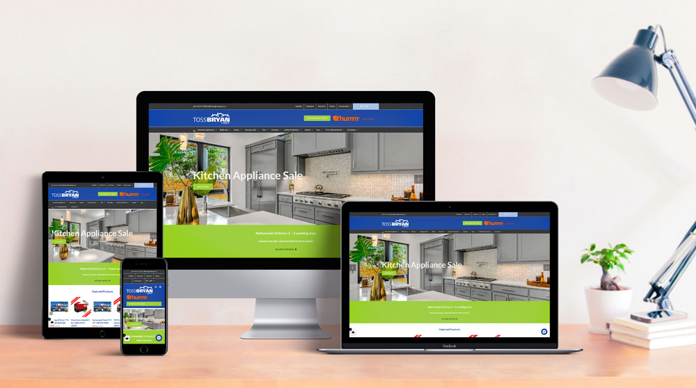
Studying various design strategies can be advantageous. Baldwin Digital had the pleasure of redeveloping the Toss Bryan website using Shopify back in 2023, this is a good example of how responsive web design works on ecommerce websites showing casing products side by side and cart funcionality.
Summary
We’ve navigated the vast landscape of responsive web design, exploring its principles, techniques, and real-world applications. Responsive design is not just a modern trend, but a necessity in today’s digital age. It is about creating flexible and adaptable websites that deliver a seamless user experience across various devices.
It’s about leveraging CSS frameworks and understanding the intricacies of fluid grids, flexible images, and media queries. But most importantly, it’s about putting the user first, prioritising their needs and experiences, regardless of the device they use. So, are you ready to embrace responsive web design and create digital experiences that truly resonate with your audience? At Baldwin Digital, we only develop websites that are responsive and also implement superb SEO, Contact us today.
Frequently Asked Questions
How to build a responsive website?
To build a responsive website, start by setting up your website with the viewport meta tag and using media queries, fluid layouts, and responsive images. Then test your website on different screen sizes. Using CSS properties like Flexbox and Grid can also help create a responsive design. Remember to set media query ranges, use percentages for layout elements, implement responsive images and typography, and test on real devices for a truly responsive website.
What are examples of responsive design?
Responsive design examples include using a navigational drawer for main mobile navigation and employing progressive disclosure to hide non-critical content for a cleaner interface. Another example is Dropbox, whose webpage adjusts significantly based on the device used.
What are the 3 basic things required for responsive web design?
For an effective and user-friendly website, three fundamental elements are crucial in responsive web design: consistency, compatibility, and the judicious use of whitespace. These components ensure a website is responsive to various devices while maintaining ease of use for the end-user.
What is meant by responsive web design?
Responsive web design is an approach in web design aimed at crafting websites to provide optimal viewing and interaction experiences—adapting the layout of websites for various devices and screen sizes using flexible grids, CSS media queries, and responsive layouts. It ensures that users have a seamless experience regardless of how they access the web across different devices.
How does responsive web design enhance user experience?
Responsive web design improves the user experience by maintaining a uniform design on various devices, adapting images smoothly and providing comparable navigation for an optimal interaction on any device.


