Table Of Contents
Importance Of Responsive Websites
With many of us using multiple devices to view content online, designing responsive websites is the way forward to ensure an optimum user experience. Here are seven vital principles that underpin responsive web design.
Key Takeaways
- Mobile or Desktop First: When embarking on responsive web design, deciding whether to start from a mobile or desktop perspective depends on your site’s purpose and target audience. Consider both approaches to determine which aligns best with your goals and user needs.
- Responsive vs Adaptive Design: Responsive and adaptive web design serve distinct purposes. Responsive design offers a single layout that adjusts based on device size, while adaptive design provides separate layouts for different screens. Choose the option that suits your project’s requirements, considering factors like ease of maintenance and control over layout.
1. Mobile Or Desktop First
Should you start responsive web design from a small mobile screen and scale it up to a desktop, or the other way around? There’s no right or wrong answer. Much depends on the purpose of your site and who you’re designing it for. Having said that, it’s a good idea to consider both perspectives when you begin, to see which route might work better for you.

2. Responsive Vs Adaptive Web Design
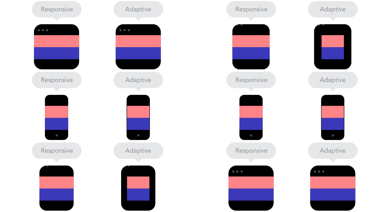
You could be forgiven for thinking responsive and adaptive web design are the same, but that’s not the case. Although they complement each other, they offer distinct purposes. With responsive design, you get one layout that changes and adjusts according to the device used. On the other hand, adaptive design focuses on various separate layouts for different screen sizes. Responsive web design is easier and quicker to build and maintain, but offers less control than adaptive design. Decide which is the right option for your needs.
3. Min & Max Values
Setting minimum and maximum values for pixel width is really useful when it comes to responsive web design. It means you can control how much content fills a screen, by setting upper and lower limits, so that it suits that particular device.

4. Breakpoints
A vital component of responsive web design, breakpoints change the layout of your content at specific points, so that it’s easier to digest. Breakpoints will vary according to the device you use, and often involve a change in the number of columns. To use breakpoints effectively, think carefully when and where to use them within your content. Overuse or incorrect application can cause confusion.

5. Nested Objects
Nesting objects rather than displaying them individually lets you wrap elements with containers, to keep everything looking neat, tidy and logical. Nested objects are affected by changes made to their main container, where objects can include text, images or HTML tags. Should a container be moved or scaled, the nested content in the container is updated accordingly.

6. Relative Units
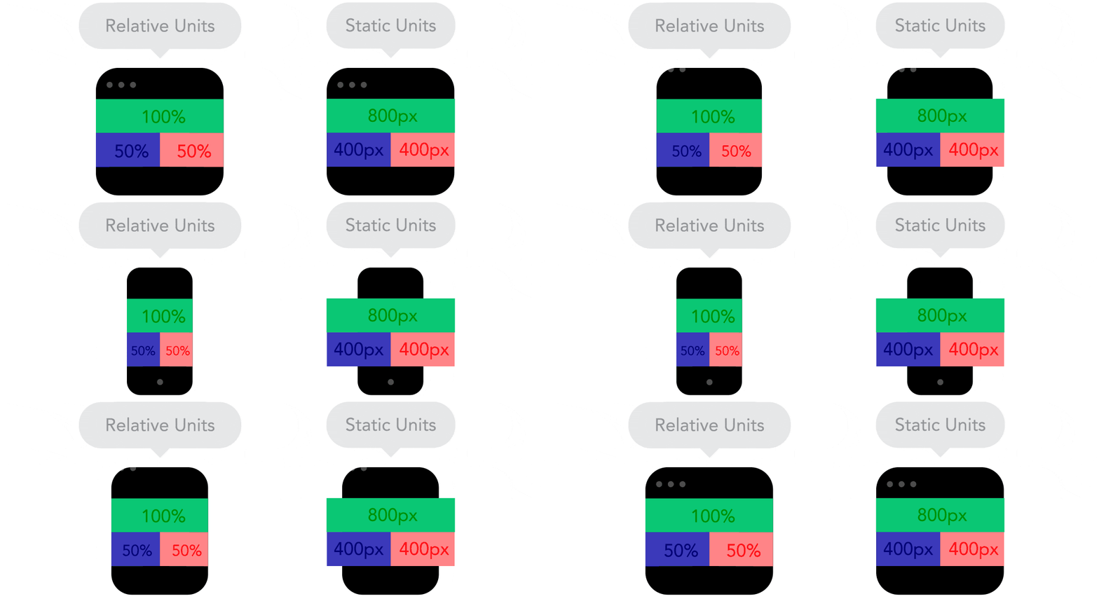
Relative units are key to responsive web design and font sizes, offering great flexibility. If you use relative units, content text resizes itself if you decide to change the browser’s default font size. Thinking in percentages is useful when it comes to relative units, so, for example, if you opt for 50% width, this will take up half the screen, whatever size of device you use. Static units are the opposite to relative units, where the content’s pixel size is fixed.
7. The Flow
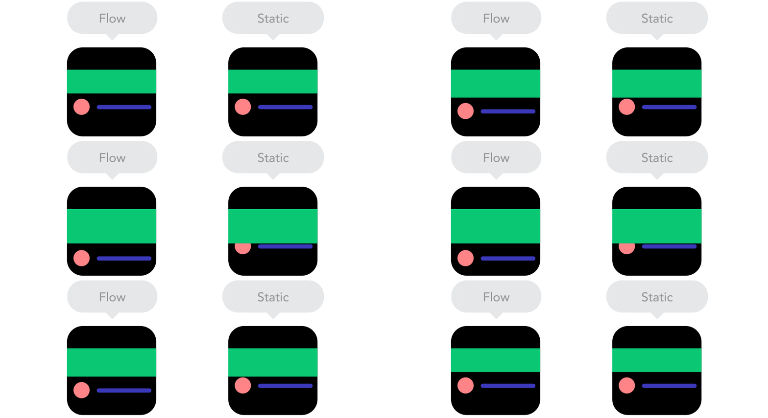
With responsive web design, flow of content takes priority over pixels and points. This is because smaller screen sizes dictate that content needs to flow vertically, rather than horizontally. The design adapts its flow according to the width of the screen. Focusing on flow can be hard at first for the newbie responsive web designer, but should get easier as you get used to this concept.
Frequently Asked Questions
Should I prioritise designing for mobile or desktop screens in responsive web design?
There’s no definitive answer. Consider the purpose of your site and your target audience. Starting from either perspective can work; however, evaluating both approaches at the beginning helps determine which aligns best with your goals and user needs.
What’s the difference between responsive and adaptive web design?
Responsive design offers a single layout that adjusts based on device size, while adaptive design provides separate layouts for different screens. Responsive design is quicker to build and maintain but offers less control, whereas adaptive design offers more control but can be more complex to implement. Choose the option that best suits your project’s requirements.
Why are breakpoints important in responsive web design?
Breakpoints are crucial as they change the layout of content at specific points, making it easier to digest across different devices. When used effectively, breakpoints ensure that content displays optimally on various screen sizes. However, overuse or incorrect application of breakpoints can lead to confusion in layout and design.


