If you know anything about branding, you’ll know that branding companies consider the look and feel of a company before creating a brand. They’ll look at what fonts and colours fit best with what the company is trying to put across to its target market, before creating a logo to suit, a targeted website design and all the branding and marketing materials along with it.
Colour is a particularly important part of this as the right colours can lift a brand out of the ordinary, and, conversely, the wrong colours can bury it without a trace. Why? Well, the clue’s in the title of this article. Colour can have a huge psychological effect on people’s mood, their behaviour, and even affect their decision to buy…or not.
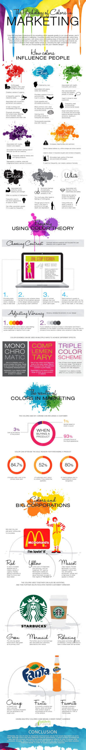
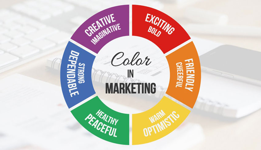
How Do Colours Influence People?
Blue: It’s calming, peaceful, reminiscent of water and a sense of tranquillity. It can even curb someone’s appetite, making it a great choice for a weight loss company. If you work in a frantic office, blue painted walls can make your staff feel secure and can also stimulate productivity. It’s also often chosen by highly conservative companies who would like their customers to see them as trustworthy, and is stereotypically the favoured colour of men.
Purple: If you’d like a regal feel to your branding, purple is associated with royalty, and also with respect and wisdom. You may have noticed that many anti-aging brands use purple. Dashes of purple can bring out your creativity and your problem-solving skills.
Red: Perfect for fast food companies as it encourages your appetite and gives you a sense of urgency, which means you eat and leave quickly, leaving room for more customers. You’ll also see it used in endless sales to heighten the need to buy now and on ecommerce websites. Red’s commonly associated with passion and excitement, and is even physically stimulating, raising your heart rate and your blood pressure.
Orange and Yellow: Bright and cheerful, optimistic colours, but orange can also make you feel cautious, and babies are known to dislike yellow to the point of crying, so use them with caution. They are great for sales and shopping displays as they can draw the eye and bring in shoppers for that impulse buy.
Black: This colour is highly authoritative and means strength, power, intelligence and stability, but it can be overwhelming if done badly or used too much.
Green: Healthy, natural, harmonious, tranquil, relaxing and growth – perfect for yoga studios and spas, but it can also stand for power. It’s the obvious choice for an environmental cause, and can help you feel balanced and make decisions more quickly.
White: Clean, pure, safe, neutral – all words which any company selling cleaning materials or medical company would want to project. White painted walls can also have the blank canvas affect and help you with your creativity.
Grey: You wouldn’t be surprised to see insurance companies that deal with funeral costs using this colour as it symbolises old age, and practicality, as well as solidarity. Don’t overdo the grey in a brand, though, as it can make people feel depressed and give them a sense of emptiness.
Properly Using Colour Theory
Now you know what effect the psychology of colour can have, it’s easier to use colours properly and give your brands that edge. Do use contrasting colours, though, to help viewers focus on the items you want to highlight, and to reduce strain on the eyes.
Think about what you’d like your customers to do, and what colours will help you get that effect, but also consider what is user friendly. Too many clashing colours can put people off, but the right use of bright colours can make people feel energetic and more likely to take action.
How Are Major Brands Using Colours?
McDonalds and KFC are obvious examples of fast food companies using bright colours to great effect. The vibrant colours appeal to kids, increase appetites and add to that sense of urgency they are looking for to get customers in through the door, fed quickly, and out again.
Just imagine if they’d chosen grey, blue or green. It’s highly unlikely that they’d be so popular today, with such calming, appetite suppressing colours.
Greenpeace is an obvious candidate for the colour green, and its branding reflects very well what it does and who it is for. Imagine it in black, oily colours, and it wouldn’t be quite so effective.
If you’d like to read more on branding, browse our article on the hidden meanings in brand logos, and see what you think about their colour choices while you’re there.
Over to you. Think about your use of colours. How can you use colour better in your marketing and branding?
Frequently Asked Questions
How do colors influence branding and consumer behavior?
Colors have a profound impact on people’s emotions, behaviors, and purchasing decisions. Each color evokes specific associations and emotions. For example, blue signifies trust and calmness, while red stimulates urgency and excitement. Understanding these psychological effects allows businesses to create effective branding strategies that resonate with their target audience.
What is the significance of proper color implementation in branding?
Proper use of colors goes beyond aesthetics; it’s about strategic implementation to convey brand messages effectively. Businesses should consider factors like contrast, readability, and user experience when incorporating colors into their marketing materials. Balancing vibrant hues with neutral tones and ensuring readability optimizes visual appeal and enhances brand recognition.
How do major brands utilise colors in their branding?
Major brands strategically leverage colors to reinforce their brand identity and appeal to their target market. For instance, fast-food chains like McDonald’s and KFC use bright colors to evoke energy, increase appetite, and create a sense of urgency. Similarly, organisations like Greenpeace use green to symbolise environmentalism and growth, aligning with their mission and values. By understanding the psychology of colors, brands can effectively communicate their message and resonate with consumers.
Psychology Of Colours Infographic