Table Of Contents
Can You Spot The Hidden Meanings?
#1. Google
Since it became the number one search engine on the planet, Google’s logo design has become one of the most recognisable around. But there’s a reason the letters appear in different colours: when first established in 1998, the fledgling company wanted everyone to know that they were playful and didn’t do things by the rules. With 18 years now in existence (1998 – 2016), the Google logo has gone through various twists and turns whilst retaining the same colours but this latest redesign by the tech giant is decidedly its most significant of all.

#2. Apple
The familiar logo of the computer giants represents the forbidden fruit from the “Tree of Knowledge” in the Biblical story of Adam and Eve.
#3. BMW
You may not know it, but BMW had a history in aviation as well as luxury cars and even created aircraft engines for the German military in World War II. The blue and white in the middle of the logo is supposed to resemble a propeller in motion, with the sky peeking through.
#4. McDonalds
The fast food giant has kept the instantly recognisable yellow letter ‘M’ branding since the very beginning. According to the BBC, the design consultant said customers will unconsciously recognise the golden arches as the “symbolism of a pair of nourishing breasts”.
#5. Volkswagen
The letters ‘V’ and ‘W’ can both be seen in the logo of the German car manufacturer. The letter ‘V’ stands for “volks”, which means people in German, while the ‘W’ stands for “wagen”, meaning car. Put them together, and you’ll know that Volkswagen is the car for the people.
#6. Amazon
Naturally, you’d probably think the arrow under Amazon’s logo resembles a smiley face, symbolising their aim to always keep customers happy. You’d probably be right. But look closely and you’ll notice the arrow goes from the ‘A’ to the ‘Z’. This represents the sheer range of items they have for sale.

#7. Audi
Many wouldn’t expect the four rings to represent anything, but they do. Each ring represents one of the founding companies of the Auto-Union Consortium of 1932. These companies were DKW, Horch, Wanderer and Audi.
#8. Adidas
The iconic three stripes didn’t initially have any meaning, but they were slanted to make the logo resemble a mountain, representing the obstacles people have to overcome. This ties in with the company’s ‘Impossible is Nothing’ slogan.
#9. Pepsi
The popular soft drink manufacturer went through one of the most expensive rebrands in history. They paid Arnell Associates $1 million to come up with a new logo. They then had to spend millions and millions more to rebrand everything with the new logo. Some time later, a 27 page document was leaked entitled “Breathtaking Design Strategy.” It contained fascinating details of how the logo draws on Feng Shui, the Renaissance, the earth’s Geodynamo and even the theory of relativity.
#10. Fedex
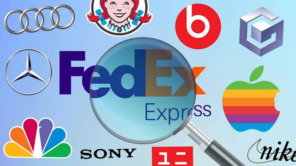
Although it looks like a very basic logo, Fedex actually contains a hidden secret. Look closely between the letter ‘E’ and ‘X’ and you will see an arrow that you probably never noticed before. This represents the company’s forward-thinking philosophy and how they’re always looking to the future.

#11. Toyota (bonus)
The three oval design at first glance seems rather simple, but the three ovals within Toyota’s current logo, introduced in 1989, can spell out every letter of Toyota. Can you spot it?
